About the project
Revitalizing the website and brand in anticipation of the next exciting phase of growth.
The Client
VOLO Beauty is an E-commerce brand selling luxury and modern tools for every day use.
The Challenge
VOLO reached out to me on the cusp of their biggest launch yet: a cordless blowdryer. At a $400 price point, they were in need of a Shopify re-design to match the luxury brand they were setting out to become. In addition, the current site presented usability, speed, and general user experience issues that needed to be addressed, fixed, and tested.
The Solution
We completely redesigned their Shopify website, along with refreshing their branding, complete with a branded photo shoot. This lead to a 20% increase in sales within 2 months and 0 return rate on the cordless dryer.
The Timeline and Tools
We worked in a two month sprint for this redesign, between March 2021-May 2021.
My role: UX/UI Designer
Stakeholders: VOLO Beauty founder and marketing director
Others involved: Shopify developer
Tools used: Miro, Figma, Shopify, Loom
Key Objectives
Identifying the Problem
The old VOLO site

First, we asked:
What areas of the website/product are most in need of improvement from a UX/UI perspective?
After a remote opportunity and strategy workshop with key stakeholders, we determined the scope, constraints, assumptions and success metrics from a user and business perspective. This guided our timeline, scope, and research and development plan.
Research
Fixing Existing Personas
We worked to revisit and redefine the user personas for the VOLO brand, which would ultimately drive the design decisions.
As common with UX/UI design, the process was not linear….
Due to budget constraints, we were not given the budget to conduct primary research with interviews and surveys. So we worked with what we could and dove deep into secondary research and a competitive analysis.
Through collaborations and interviews with the marketing and customer service team, we looked into trends and data that helped answer:
What our customers want (shared common goals)
Who they are (both generally and individually)
What bothers them (areas of friction)
Based off of this information, we were able to make some assumptions and formed two main proto-personas.
Key Insight

Through analysis of customer service and social media data, we discovered a new VOLO target persona that trended a bit older than the previously established persona.
We found a reoccurring trend of women ages 60+ with expendable income that tend to admire quality over quantity.
Purchase behavior: They enjoy bundling the towels as gifts for friends and family.
Frustrations: They are frustrated by confusing navigation and paths to purchase that are not straightforward.
“Catherine”
“My kids are everything to me. I love surprising them with something they will actually use and value. I get “mom points”, although they would never admit that”
Age: 62 | Location: Minneapolis MN | Life Stage: Married and Retired
What we did with this information…
-
Suggest adding older women to the brand photo and video shoot.
-
Allow the opportunity to bundle items
Add gift wrap and messaging options
Add quick shop
-
Add clear and concise information about the dryer on the product page.
Avoid the use of trendy language.

Insights in action! Based off of our persona insight, the VOLO brand photoshoot included older women.
Next, we evaluated the current website
Heuristic Evaluation

Due to budgeting constraints, I was not able to run user testing of the current site to see what needed improving and what we needed to consider and prioritize for the redesign. So I decided to run a heuristic evaluation to get a quick sense of the current user experience of the site.
After having an initial look at the website initially and being empathetic towards the user personas, the website had confusing navigation with no search functionality, the content architecture lacked focus and direction, and some user flows, including checkout, were more complex than they needed to be. We would work on fixing this.
Key Insight:
The biggest improvements we found were needed were:
Help and documentation: this was a big one. For the launch of a unique product at a high price point, we need to answer the right questions in the right way.
Minimalist design: The current site was not fully responsive and featured inaccessible sections. In addition, we would focus on minimizing unnecessary information and breaking up text with images, icons, and accordions. Improvement of content architecture was going to be a focus.
Next, we peeked at the competition
Competitive Analysis

VOLO had already done competitor analysis and shared that information with us. We wanted to take a look specifically at how the competition presented themselves online and how they differentiated themselves, digitally.
Key Insight:
In the cordless dryer space, most competitors on the market are on the cheap end in terms of branding, manufacturing, and price point. Their dryers are technically cordless, but they also use a damaging type of heat, don’t hold charge for long, and have a shorter life span. We also could not find a single one with a distinct online brand.
VOLO easily differentiates themselves from most of the cordless dryer competitor as the more luxurious, tech-forward, and salon tested option on the market with a distinct brand.
However, the closest competitor with a nearly identical product (from what we could tell) had not launched yet and seemed to be stalled in production. We would be blazing the trail in the high end cordless space and setting the tone for any competition to come. Exciting!
Then we brainstormed and reframed pain points…
How Might We?
Taking what we learned, we framed the pain points into “how might we” statements.
How might we guide users towards a frictionless checkout process?
How might we give the user appropriate and useful information about the cordless dryer, without overwhelming them?
How might we tell the story of the dryer in a clear and concise way?
How might we help make the shopping process enjoyable and exciting for users?
How might we encourage gifting and bundling?
Let’s begin to map out the site architecture…
SiteMap

Key Insight
A lot of E-commerce websites are overwhelming to the average user (which is also a key insight from our proto persona, Catherine.) Loads of products and page sections, with confusing navigation. With the benefit of a small stock of SKU’s, we would focus the website on simplicity and the main sell: the dryer. The main navigation only holds three tabs, shop now, about us, and get help. Additionally, there’s a standard secondary navigation options for account, search and cart.
Now we begin laying our ideas out
Wireframes
This is where it starts coming together. Here’s a few highlights…
Dryer use guide: As we brainstormed and ideated, we came up with the design for a dryer use guide: a page fully dedicated to customers of the cordless dryer, with videos and text step-by-step instructions on using the dryer.
Side by side USP sections: both the VOLO towels and dryer have distinct USP’s that were important to express. We want to showcase these in an appealing way, with full width brand imagery split with text on individual product pages.
Accordion tabs for streamlined product information: In addition to the side by side USP callouts, we designed accordion tabs for FAQ’s, Description, and How it Works.

Time for the polished look…
High-fidelity and development
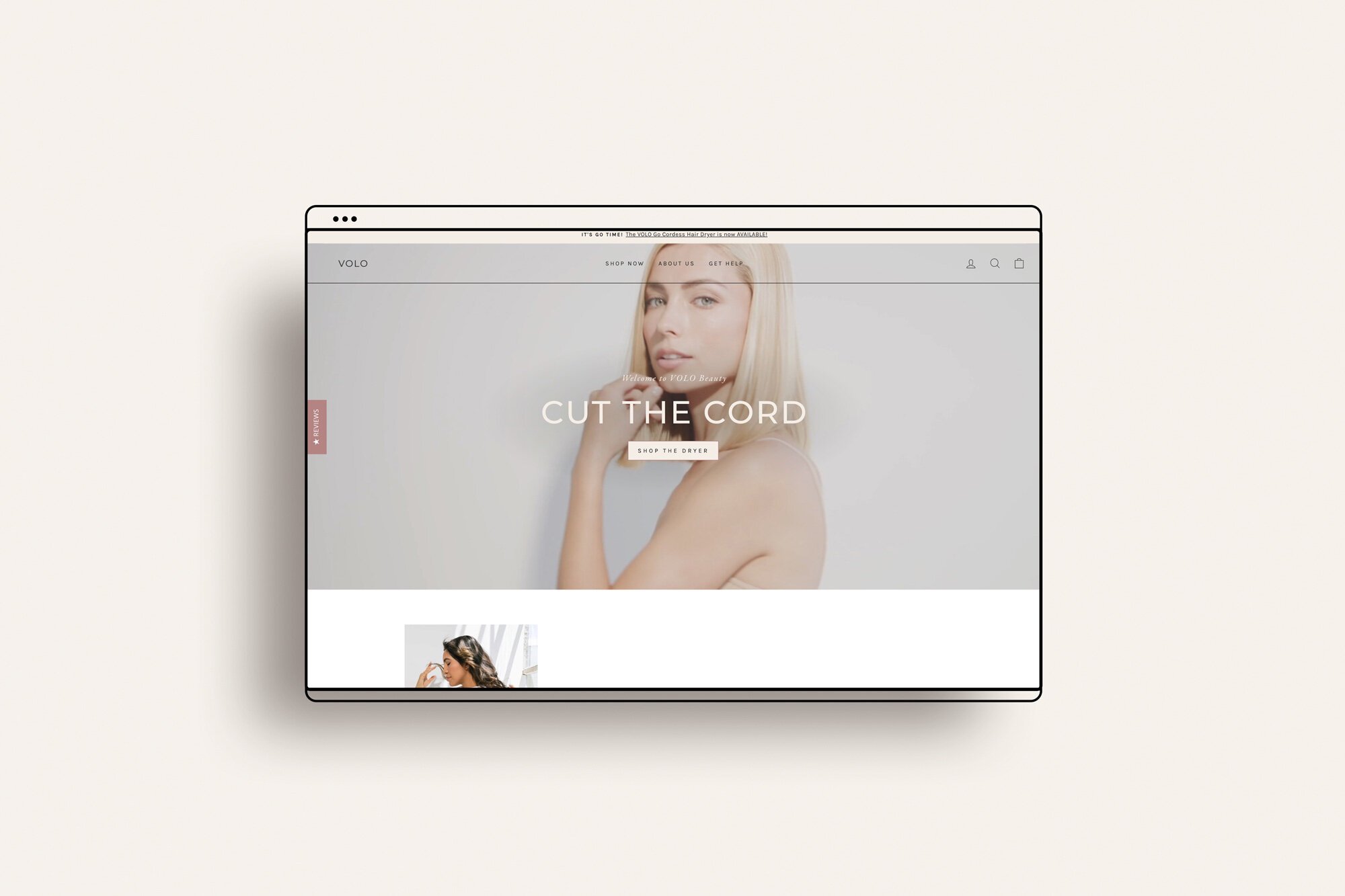
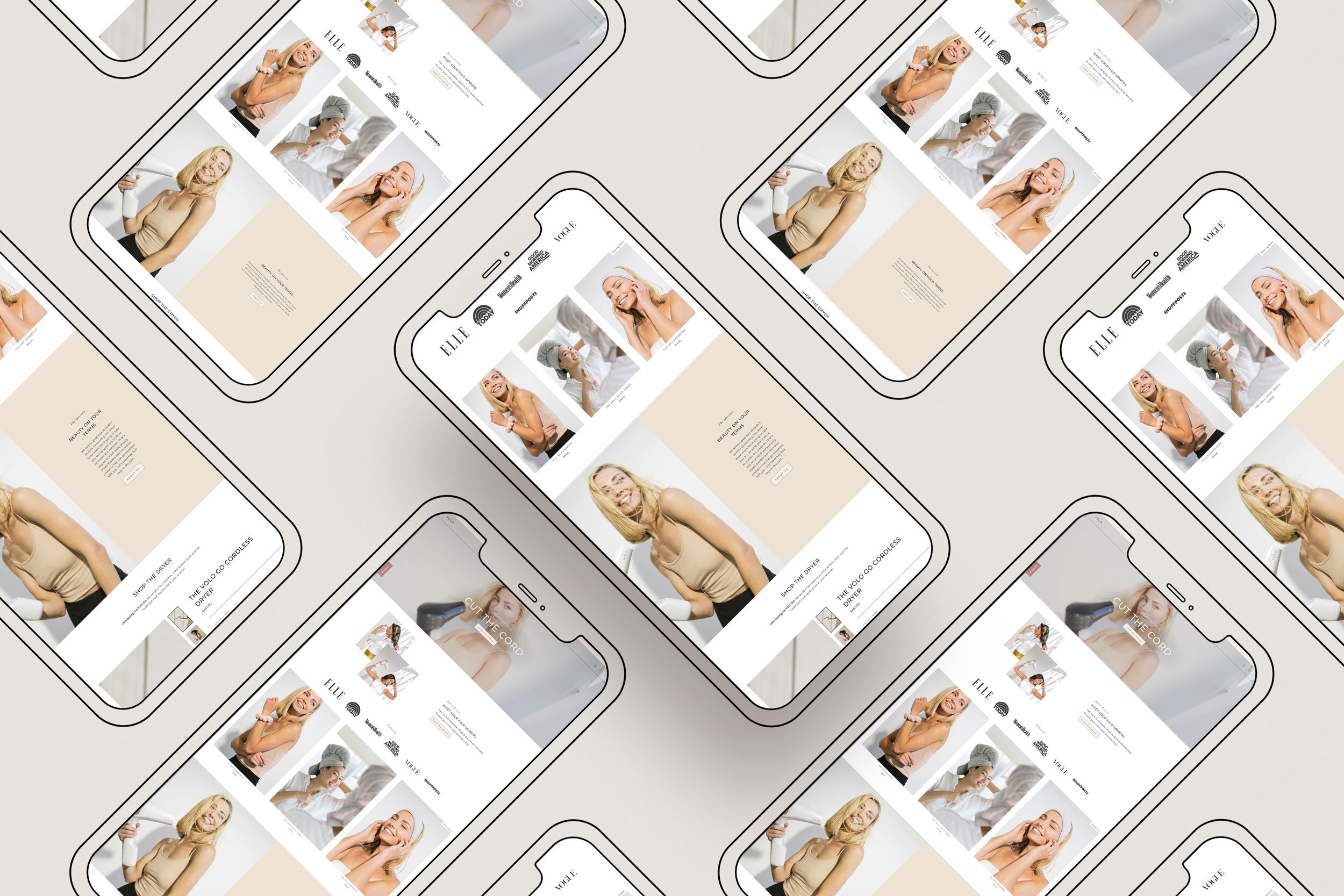
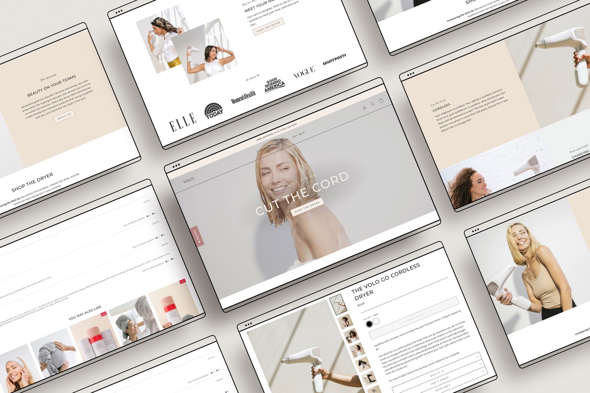
On the home page, we implemented an auto-play video showcasing the cordless dryer in action to immediately draw the user in.

We designed product pages to house helpful information in a concise accordion dropdown. Additionally, we implemented a shop the product on the home page, so users could immediately see the cordless dryer and product specs. Quick buy was also added to make ease of check-out a breeze.
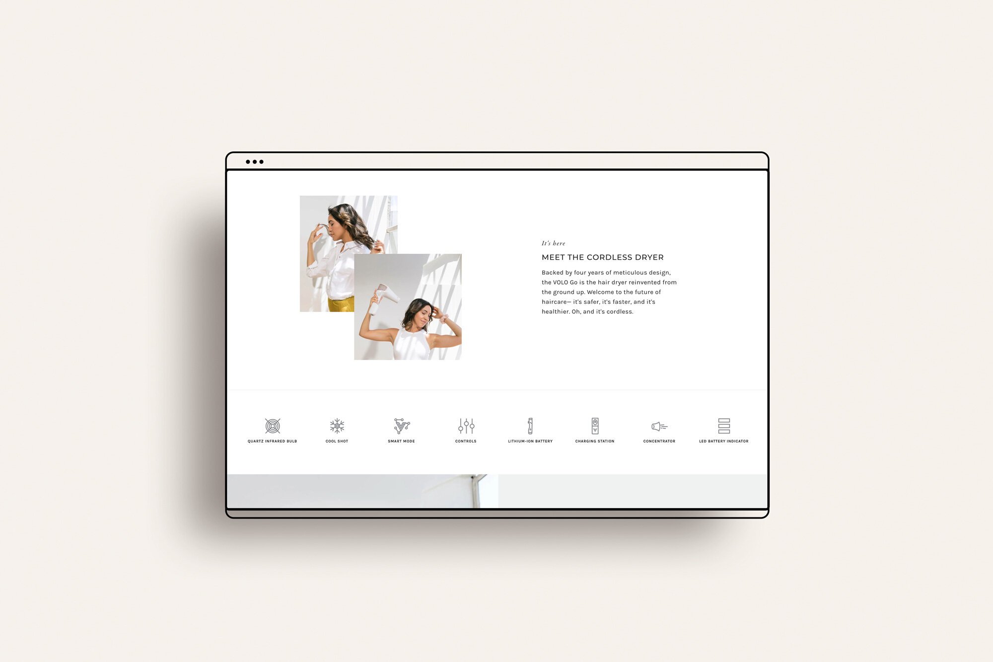
The cordless dryer contains lots of important information. We chopped this info up into a series of icons, text, and images to create a better user experience.
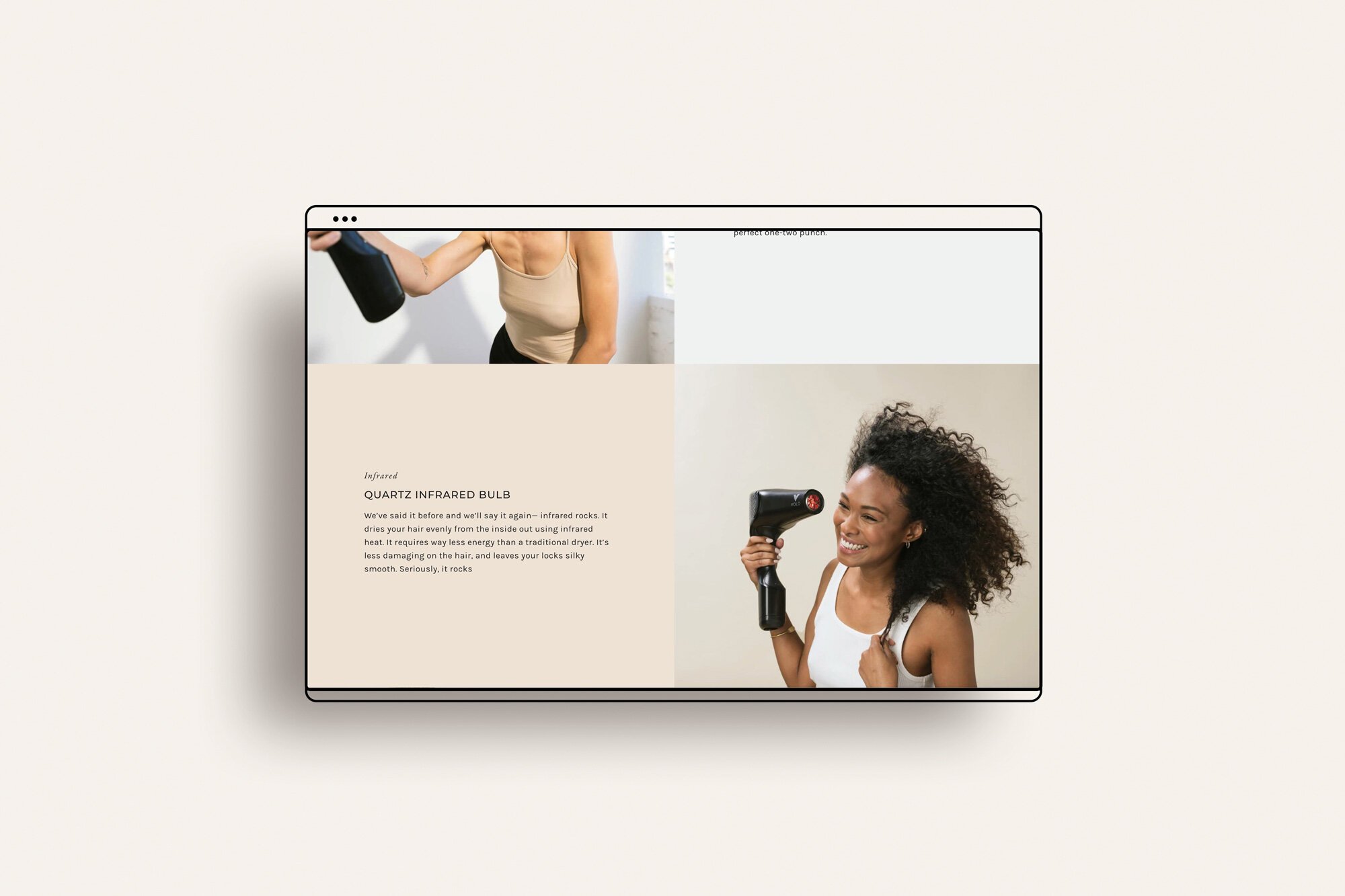
The dryer and microfiber towel are their most popular items. For these product pages, we custom coded additional sections to showcase more information about each, including beautiful split sections with images and text.
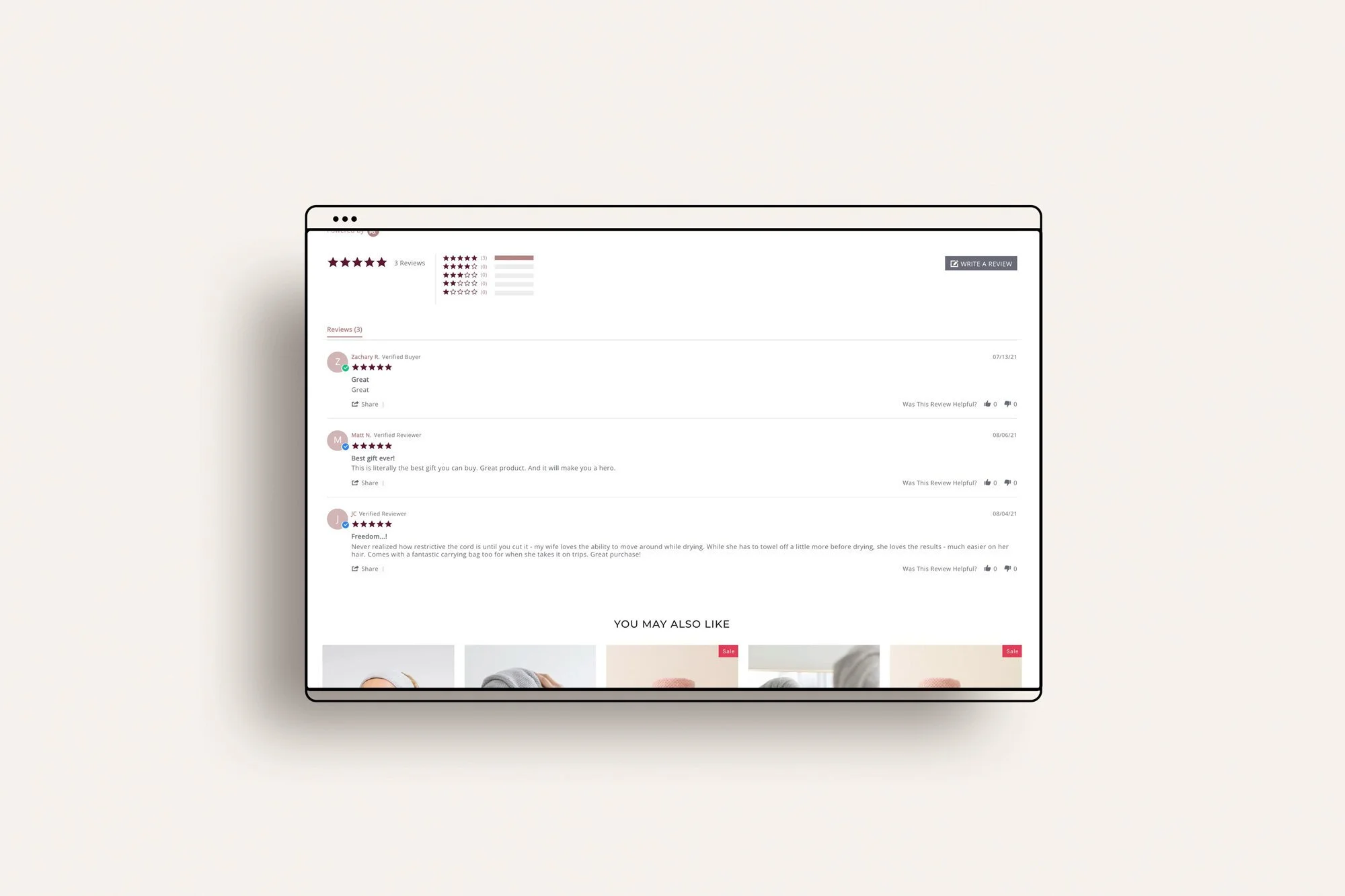
Social proof and personalization are important aspects to any ecommerce site. Reviews and recommended products were added to each product page.
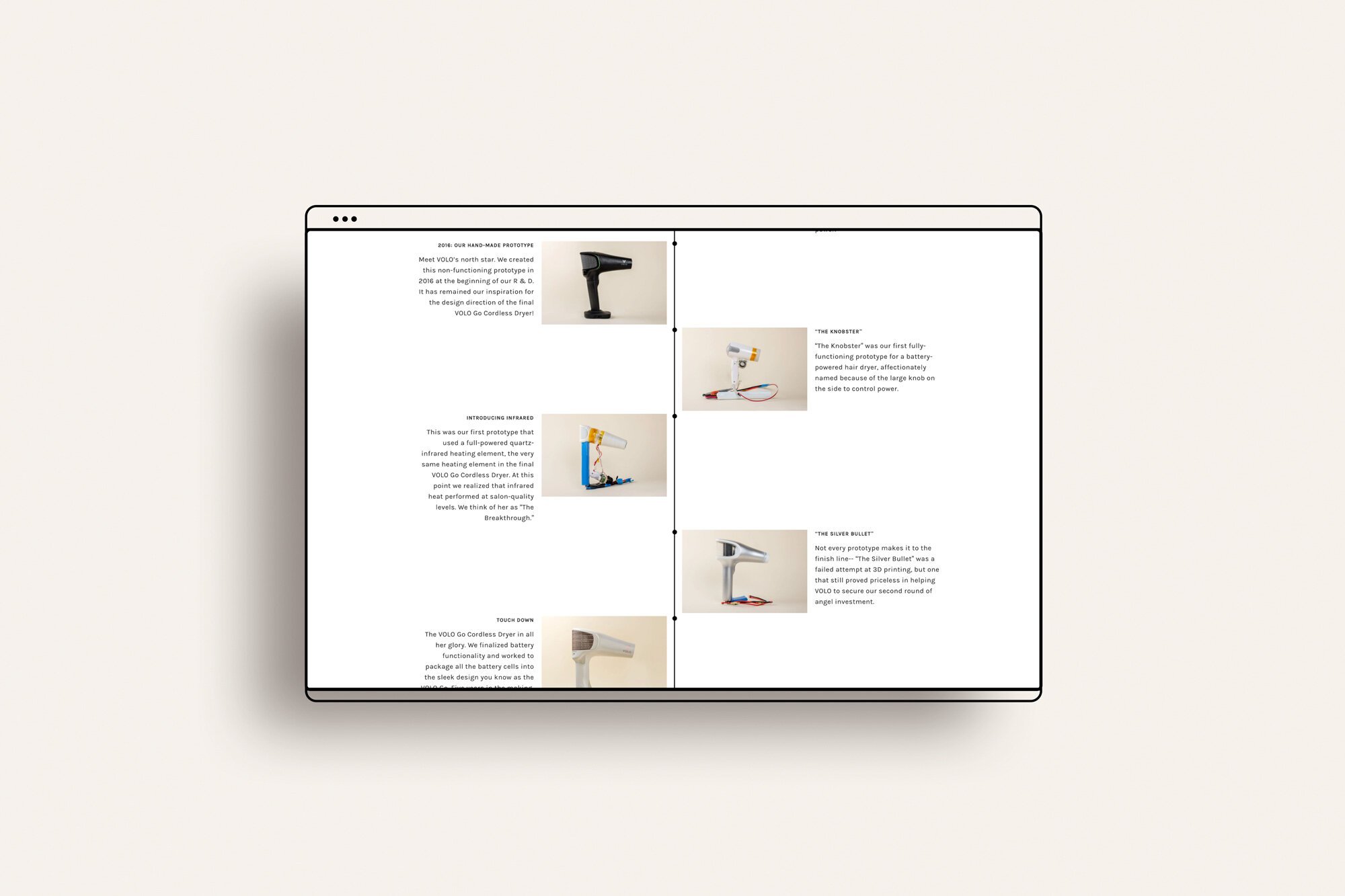
The cordless dryer look years of meticulous research and testing. We wanted to convey the thought and work that went into the final product, so we coded a "timeline" feature onto the about page to tell the story in an engaging way.
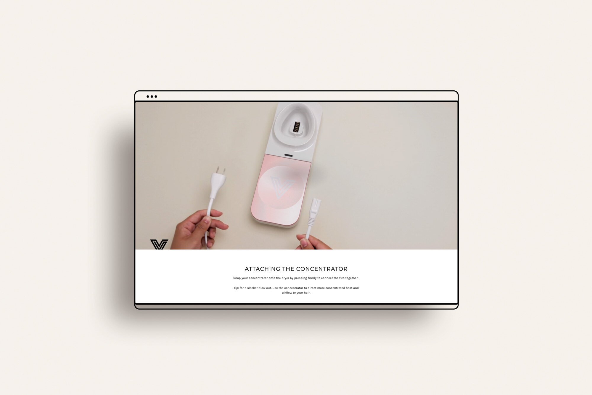
The cordless dryer is unlike anything on the market. To reduce return rate, we added a post-purchase "dryer use guide" filled with helpful videos and text to walk the customer through the process of setting up and maintaining their new dryer.

Time for the polished look…
Results and Takeaways
We hit our 30 day result goal and the retro is still ongoing. The main takeaway for me was the fact that we could actually make an impact under budget constraints. Although we could not interview customers, having access to customer service data was valuable and something I will always ask for when working on redesigns. It allowed us to really hone in on a key customer and design the site with their needs in mind. Content architecture was a big part of this project as well and we learned the value of showcasing important information in different ways beyond just text (videos, images, icons, accordions etc).

The Site
This site was designed in partnership with Studio Haf (my talented Shopify developer).
